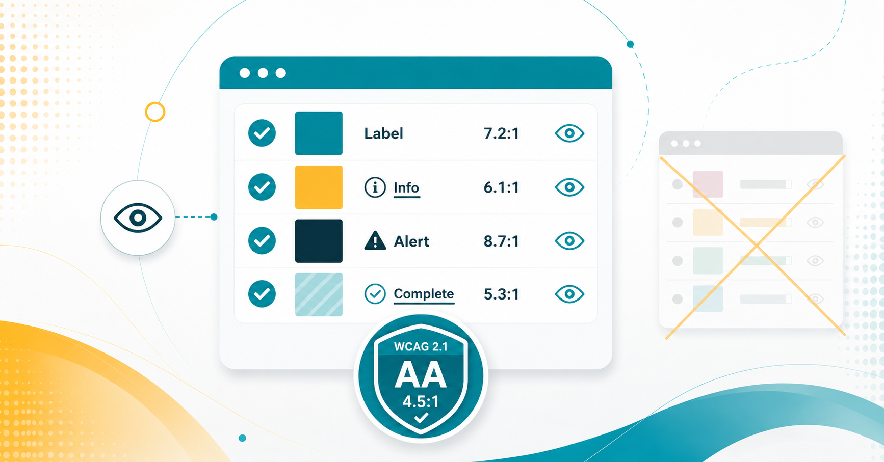
Color can enhance readability and engagement, but it must be used carefully to ensure accessibility for all users. Relying solely on color to convey meaning can create barriers for individuals with color blindness or visual impairments. Instead, use multiple methods, such as bold or italic text, to emphasize important content. Proper color contrast also improves readability for students viewing content on different screens and lighting conditions.
Color with Care: Accessibility in Canvas
More Tech Tuesday Posts


Panorama, Canvas, and Accessible Course Content September Webinar
This session introduces Panorama and demonstrates how faculty can use it alongside Canvas to…

Accessibility in Action Series
Join Juliet Crocco, CTLA Training and Development Consultant, throughout the academic year for practical…

When Panorama Keeps Flagging the Same Issue
Panorama is a useful starting point for identifying accessibility issues in Canvas, but not…
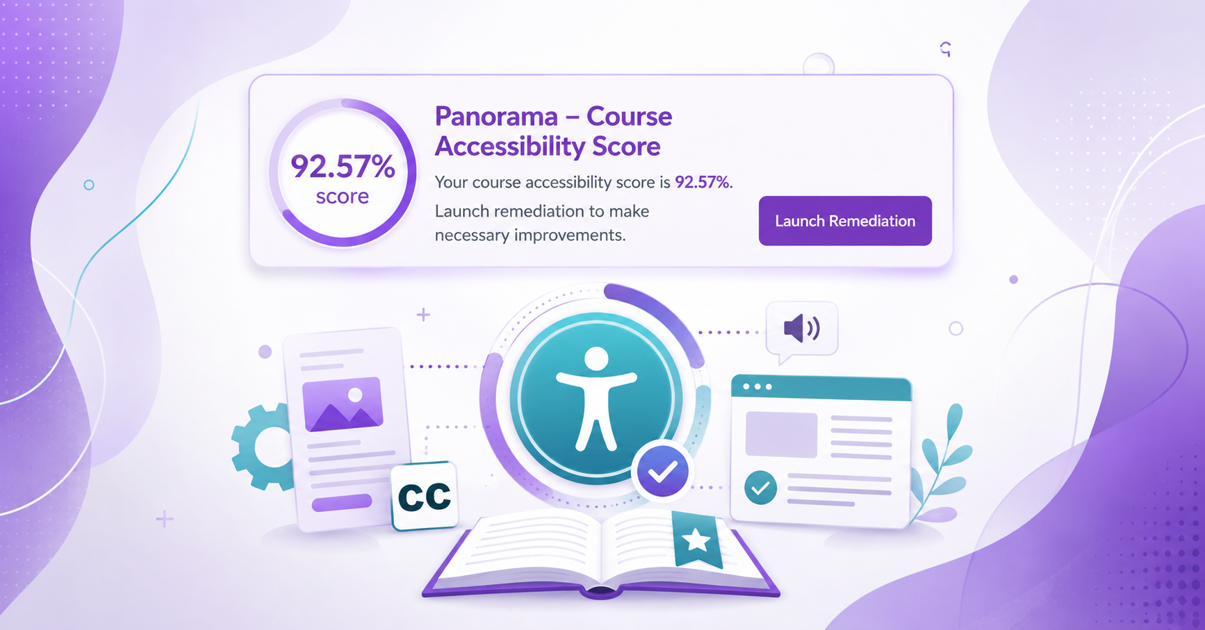
Enabling the Course Accessibility Banner with Remediation Tool on Canvas
Panorama provides several ways to find and address accessibility issues in Canvas. In addition…

Using the Panorama Accessibility Report to Remediate Files
Panorama can help guide the accessibility remediation process for files in your Canvas course,…

Grey Be Gone! Fixing Panorama Icons in Canvas
If you see a grey, unprocessed Panorama icon in your Canvas course, it means…