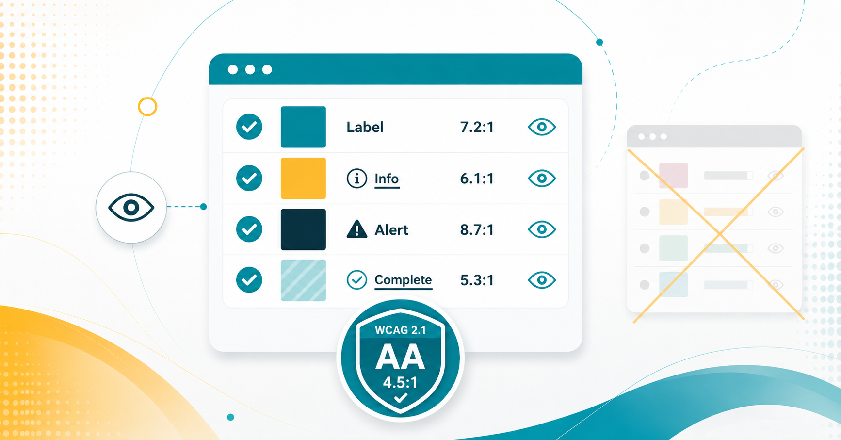
Color can enhance readability and engagement, but it must be used carefully to ensure accessibility for all users. Relying solely on color to convey meaning can create barriers for individuals with color blindness or visual impairments. Instead, use multiple methods, such as bold or italic text, to emphasize important content. Proper color contrast also improves readability for students viewing content on different screens and lighting conditions.
Color with Care: Accessibility in Canvas
More Tech Tuesday Posts

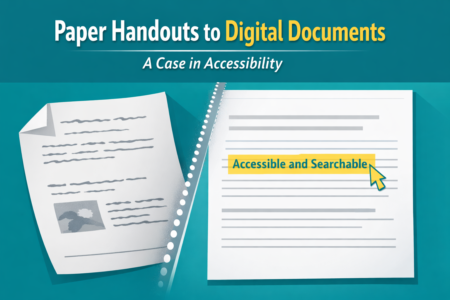
Paper Handouts to Digital Documents – A Case in Accessibility
A faculty member recently came to me with a challenge. She had a student…

The Secret Life of Canvas Files
Now that many of us organize our courses using Modules with Pages and Assignments, it’s…

Minimizing the “Junk in Your Trunk” for a Clean Canvas
How do you create clean imports to Canvas via Panorama?…

Google Accessibility with Grackle!
How can Grackle help with accessibility in the Google Workspace?…

Using AI for Digital Accessibility
How can you use AI to assist you in enhancing digital accessibility?…

From Icons to Insight – Making Sense of Panorama in
This is how you can further utilize Panorama to get the most out of…